Chapter 4: CSS
CS 80: Internet Programming
Instructor: Mark Edmonds
Intro to CSS
- CSS = Cascading Style Sheet
- What does HTML5 do?
- Specifies the content and structure of the webpage
- So far, we haven’t controlled the presentation of the webpage at all.
- CSS allows us to control the presentation of the page
Intro to CSS
- Why not control the presentation within the HTML?
- You can!
- But in general, it’s better to separate!
- Why? Because you can swap the style without changing anything in the HTML document
Inline Style
- Specify the style in the html tag through a
styleattribute- E.g. to change the font size, one might apply the
attribute
style="font-size: 45pt;"which would set the font size to 45pt.
- E.g. to change the font size, one might apply the
attribute
Inline Styles
- Advantage:
- Styling is applied solely to this instance of the tag (useful if we want custom styling for one particular tag)
- Disadvantage:
- Styling is applied solely to this instance of the
tag (meaning it has no generality; we can’t change
the style of every tag across the entire document. In
our example, we may want to change every
<h2>in the document
- Styling is applied solely to this instance of the
tag (meaning it has no generality; we can’t change
the style of every tag across the entire document. In
our example, we may want to change every
Example: inline_styles.html
<!DOCTYPE html>
        <html>

        <head>
          <meta charset="utf-8">
          <title>Inline CSS Styling</title>
        </head>

        <body>
          <p style="font-size: 45pt">We can apply styling to one HTML tag</p>
          <p>But take notice it doesn't persist in the document</p>
          <h2 style="font-family: helvetica, tahoma, sans-serif; font-size: 10pt; color: blue">We can overrride default settings for tags, notice the bold is still applied! </h2>
          <p>Note: browser will attempt to use font-family specified in order of the comma-separated list. The last entry in the list should be a generic font style (serif sans-serif, cursive, fantasy, monospace)</p>
        </body>

        </html>
Embedded Style Sheets
- Idea: embed a styling sheet inside the
<head>tag of the HTML document - Example:
/* css to modify all p tags */
        p {
          font-size: x-large;
          font-family: arial, sans-serif;
        }
Embedded Style Sheets
- What does this do?
- Changes every
<p>tag in the document to have an extra large font and use Arial font
- Changes every
Embedded Style Sheets
- Each property is a key-value pair
- Key is the property to change
(e.g.
font-size) - Value is the setting of the property
(e.g.
x-large) - Key and value are always separated by a
:and the key-value pair is terminated with a;
- Key is the property to change
(e.g.
Embedded Style Sheets
- Advantage:
- Styling is applied across every instance of an element in the entire document
- Disadvantage:
- Styling is still restricted to this HTML document; we cannot “export” the embedded style sheet to other HTML documents
Example: embedded_styles.html
<!DOCTYPE html>
<html>
<head>
<meta charset="utf-8">
<title>Embedded CSS Styling</title>
<style type="text/css">
p { font-size: x-large;
font-family: arial, sans-serif; }
</style>
</head>
<body>
<p>This tag is begin styled by the global styling of <p></p>
<p style="font-size: x-small;">But notice that inline styling <strong>always</strong> takes precendence over global styling</p>
<p>This tag is begin styled by the global styling of <p></p>
</body>
</html>
Common CSS Properties
-
font-family- Names the font to use.
- Typically a comma-separated list. The browser
will attempt to use the first font availabe in the
list. The final entry in the list should be a generic
font, like
serif,sans-serif,monospace,cursive, orfantasy - Example:
font-family: helvectica, tahoma,
              sans-serif;
Common CSS Properties
-
font-size- Controls the font size of text
- Can specify size two different ways: through a
point value (
NUMBERpt)or with a relative size - Available relative sizes:
xx-small``,
              x-small, small, smaller, medium, large, ``larger``,
              x-large, xx-large
) - Preferrable to use relative sizes
- Why? Different computers have different
resolutions, so using
ptwill result in different effects based on the user’s display
- Why? Different computers have different
resolutions, so using
- Example:
font-size: x-small;
Common CSS Properties
-
font-style- Controls the font’s additonal styling
- Possible values:
normal, italic, oblique - Example:
font-style: italic
Common CSS Properties
-
background-color- Sets the background color. Takes hexidemial value or rgb
- Example:
background-color:
              #668B8B
Example: background_color.html
<!DOCTYPE html>
<html>
<head>
<meta charset="utf-8">
<title>Background Color</title>
<!-- style defaults to "text/css" -->
<style>
body { background-color: #668B8B;
font-style: italic}
p { background-color: black;
color: #0198E1; }
</style>
</head>
<body>
Here's <span style="background-color: coral">some text no</span> in a <p> tag
<div style="background-color: #F0F8FF;">
<p>
Here's some text overriding the background
</p>
And here's some ever more text overriding both settings!
</div>
<p>
Here's some text overriding the background
</p>
</body>
</html>
Common CSS Properties
-
background-image- Takes a
url('image')and uses it as the background - Can have a list of comma-separated
url()’s to fetch - Example:
background-image:
              url('http://eskipaper.com/images/sand-dune-pictures-1.jpg')
- Takes a
Example: background_image.html
<!DOCTYPE html>
        <html>

        <head>
          <meta charset="utf-8">
          <title>Background Image</title>
          <!-- style tag defaults to CSS -->
          <style>
            body { background-image: url(http://www.noupe.com/wp-content/uploads/2009/10/pattern-13.jpg);
                 }
            p    { background: #000000 url('https://i.stack.imgur.com/pMAiU.jpg') center center no-repeat;
                   color: white;
                   text-align: center; }
          </style>
        </head>

        <body>
          <p>Lorem ipsum dolor sit amet, consectetur adipiscing elit. Etiam nec lectus et diam rutrum efficitur id non risus. Pellentesque vitae velit lacinia, sollicitudin turpis in, lacinia enim. Cras in leo a nisl ullamcorper lacinia. Aliquam eu dignissim arcu. Ut ultricies orci quis sollicitudin malesuada. Morbi in mauris sed nisl gravida lobortis. Vestibulum tempor justo consectetur, pharetra lorem eget, posuere quam. Mauris leo libero, vestibulum sed viverra sed, ornare non urna. Suspendisse accumsan a libero a ullamcorper. Sed eu hendrerit est, ut consectetur neque. Lorem ipsum dolor sit amet, consectetur adipiscing elit. Integer diam justo, sodales a dolor sed, laoreet blandit urna. Vestibulum vestibulum ac arcu quis ornare. Nulla luctus tristique nisl vel tristique. Sed vel massa eget mauris pharetra ultrices.

          Lorem ipsum dolor sit amet, consectetur adipiscing elit. Etiam nec lectus et diam rutrum efficitur id non risus. Pellentesque vitae velit lacinia, sollicitudin turpis in, lacinia enim. Cras in leo a nisl ullamcorper lacinia. Aliquam eu dignissim arcu. Ut ultricies orci quis sollicitudin malesuada. Morbi in mauris sed nisl gravida lobortis. Vestibulum tempor justo consectetur, pharetra lorem eget, posuere quam. Mauris leo libero, vestibulum sed viverra sed, ornare non urna. Suspendisse accumsan a libero a ullamcorper. Sed eu hendrerit est, ut consectetur neque. Lorem ipsum dolor sit amet, consectetur adipiscing elit. Integer diam justo, sodales a dolor sed, laoreet blandit urna. Vestibulum vestibulum ac arcu quis ornare. Nulla luctus tristique nisl vel tristique. Sed vel massa eget mauris pharetra ultrices.
          </p>
        </body>

        </html>
Common CSS Properties
-
background-repeat- Specifies whether or not you would like the background to repeat or not
- By default, background repeats
- Possible values:
repeat, repreat-x, repeat-y, no-repeatrepeatwill repeat in both the x and y direction
- Example:
background-repeat:
              repeat-x
Common CSS Properties
-
background-position- Specifies the background relative to the HTML element.
- X is offset from the left and Y is offset from the top
- Takes unit values (like width and height) or
left, right, center,for Xtop, bottom, centerfor Y - By default, background position is (0,0) relative to the element’s position in the document
- Example:
background-position: center left;- If you only specify one, the other will default to center
Common CSS Properties
-
background- This is a shorthand way to apply all of the above
background: bg-color bg-image position
              bg-repeat
Common CSS Properties
-
text-align
center,left, orrightto align text
- CSS property list reference: https://developer.mozilla.org/en-US/docs/Web/CSS/CSS_Properties_Reference
CSS Classes and Selectors
- It’s pretty limiting to only be able to use CSS styling on an element-by-element basis
- CSS classes are applied to a tag on a tag-by-tag
basis using the
classattribute - Advantages:
- Can use the same class among multiple HTML tags
- Updating the CSS class will update all tags
CSS Classes and Selectors
-
Usage: all classes start with
. -
Example:
.myemph { font-style: italic; } -
Apply this class using the
classattribute:<p class="myemph">some_text</p>
CSS Classes and Selectors
-
We can even apply certain classes only to specific HTML tags
- This type CSS styling increases the specifcity of the styling, which help resolve styling conflicts (more on this in a bit)
-
Example:
p.myemph { font-style: italic; }- only defines our
myemphclass for use within a<p>HTML tag
- only defines our
CSS Classes and Selectors
-
Selectors are a bit more general (classes are a type of selector)
- They specify how the CSS rules should be applied
- A class is a selector rule, but we also have
selectors for
id’s with#id
-
Example:
#htmlid { color: blue } -
Corresponding HTML:
<section id="htmlid">
CSS Precedence
- ID selection has the highest precedence
(e.g.
#id) - Followed by tag-specific classes
(e.g.
p.myemph) - Followed by classes
(e.g.
myemph) - Followed by HTML tag rules
(e.g.
p)
Conflicting Styles
- What does Cascading mean?
- “falling through”
- So far, we’ve seen rules will maintain their presence
in nested children until something overwrites their value
(consider
background_color.html)
Conflicting Styles
- But what’s the actual logic here?
- Children of HTML elements inherit the CSS styling of their parents
- Children style’s have a higher precendence over their parents, so their styling will always replace their parents (if applicable)
Conflicting Styles
- Let’s try a weird scenario:
- We defined a
myemphboth as a CSS class and a CSS class for<p> - So what happens when we write a normal
<p>(no class specified) inside of a<div class="myemph">?
- We defined a
Example: conflicting_styles.html
<!DOCTYPE html>
        <html>

        <head>
          <meta charset="utf-8">
          <title>Classes and Selectors</title>
          <style>
            .class1 { font-style: oblique; color: red;}
            #blueele   { color: blue; }
            p.class1 { font-style: normal; color: green;}
          </style>
        </head>

        <body>
          <div class="class1">
            This text adheres to the global CSS emph class
          <p>
            But with no class specified in the paragraph tag, the child is still inheriting from the parent
          </p>
          <p class="class1">
            Now we have a p tag with class1 directly applied, so text is normal and green.
          </p>
          <p class="class1" id="blueele">
            But now that we apply the more-specific class, the div is overridden
          </p>
          </div>
        </body>

        </html>
Conflicting Styles
- There are other ways to generate conflicts (such as
background_color.htmlusing normal nesting) - But the general rule: the most specific styling takes precedence
External Style Sheets
- Idea: store the style sheet elsewhere and import it into the HTML document
- Advantages:
- We can use the same styling across multiple HTML documents
- If they all import the same external style sheet, they will all adhere to the same styling rules
- If we change the stylesheet once, it will affect all documents that link to it!
- The
<link>HTML tag is used to import external styling
External Style Sheets
-
Attributes required:
rel="stylesheet"specifies the relationship between this document and the external one, in this case, we want to link to a stylesheettype="text/css"just like how we specified with<style type="text/css">href="style.css"is the hyperlink reference to the external document
-
Example:
<link rel="stylesheet" type="text/css" href="style.css">
Example: external_styles.html
<!DOCTYPE html>
        <!-- Fig. 4.8: external.html -->
        <!-- Linking an external style sheet. -->
        <html>

        <head>
          <meta charset="utf-8">
          <title>Linking External Style Sheets</title>
          <link rel="stylesheet" type="text/css" href="style.css">
        </head>

        <body>
          <h1>Shopping list for <em>Monday</em>:</h1>
          <ul>
            <li>Milk</li>
            <li>Bread
              <ul>
                <li>white bread</li>
                <li>Rye bread</li>
                <li>Whole wheat bread</li>
              </ul>
            </li>
            <li>Carrots</li>
            <li>Yogurt</li>
            <li>Pizza <em>with mushrooms</em></li>
          </ul>
          <p><em>Go to the</em>
            <a class="nodec" href="http://www.deitel.com">
        Grocery store</a>
          </p>
        </body>

        </html>
CSS Comments
/* This is a CSS comment. start with /* and end with */ */
CSS Units
- Used to control sizing
#emamount relative to the normal size#cmamount in centimeters#pxamount in pixels#ptamount in points- Keep these in mind when looking at CSS
CSS Positioning
-
positionproperty controls the location of document elements
- Basic idea: answers the question: where should this element be relative to other elements?
CSS Positioning
position property
- Corresponding attributes:
left: value;andtop: value;which control the amount of positioning to apply- “left” corresponds to how much to move from left
- “top” corresponds to how much to move from the top
- See: http://www.w3schools.com/cssref/pr_pos_left.asp for values
- Keep these mind when considering the various positioning types
CSS Positioning
Absolute positioning
-
position: absolute;sepcifies this elements position relative to it’s first positioned (not static) ancestor element
- “Ancestor” refers to the parents of this HTML element (nesting establishes parent-child relationships)
CSS Positioning
Relative positioning
-
position: relative;specifies the element’s position relative to its normal positioning
- So if we move 5px from the left and 10px from the top, the element is positioned right 5px and down 10px
CSS Positioning
Fixed positioning
position: fixed;specifies the element’s position relative to the browser window
CSS Positioning
Static positioning
position: static;the default behavior, positioning is determined by document flow/ordering- Property values: http://www.w3schools.com/cssref/pr_class_position.asp
Example: positioning.html
<!DOCTYPE html>
        <!-- Based on: http://learnlayout.com/position-example.html -->
        <html>

        <head>
          <meta charset="utf-8">
          <title>CSS positioning</title>
          <link href="https://dl.dropbox.com/s/p6zt773weewbvzs/styles.css" rel="stylesheet" type="text/css" />
          <style>
            .container {
              position: relative;
            }

            nav {
              position: absolute;
              width: 200px;
            }

            section {
              /* position is static by default */
              margin-left: 200px;
              padding: 5px;
            }

            footer {
              position: fixed;
              padding: 20px;
              bottom: 0;
              left: 0;
              height: 70px;
              background-color: white;
              width: 100%;
            }

            body {
              margin-bottom: 120px;
            }

            .div1 {
              height: 100px;
              width: 100px;
              overflow: hidden;
            }

            .div2 {
              height: 415px;
              width: 715px;
              overflow: scroll;
            }

            /* increase the height and width (koala.jpg is 710 x 408) to see the scroll disappear */
            .div3 {
              height: 415px;
              width: 715px;
              overflow: auto;
            }
          </style>
        </head>

        <body>
          <!-- positioned relative to its normal setting; has no effect size we didn't move it (play around with it!) -->
          <h3>CSS Positioning and Element Dimensions</h3>
          <div class="container">
            <!-- our nav CSS applies; width is 200px -->
            <nav>
              <ul>
                <li><a href="http://google.com">Google</a></li>
                <li><a href="http://google.com">Google</a></li>
                <li><a href="http://google.com">Google</a></li>
                <li><a href="http://google.com">Google</a></li>
                <li><a href="http://google.com">Google</a></li>
              </ul>
            </nav>
            <!-- our section CSS applies; margin is 200px (will be on the right of nav)-->
            <section>
              The margin-left style for sections makes sure there is room for the nav. Otherwise the absolute and static elements would overlap
            </section>
            <section>
              Lorem ipsum dolor sit amet, consectetur adipiscing elit. Phasellus imperdiet, nulla et dictum interdum, nisi lorem egestas odio, vitae scelerisque enim ligula venenatis dolor. Maecenas nisl est, ultrices nec congue eget, auctor vitae massa. Fusce luctus vestibulum augue ut aliquet. Mauris ante ligula, facilisis sed ornare eu, lobortis in odio. Praesent convallis urna a lacus interdum ut hendrerit risus congue. Nunc sagittis dictum nisi, sed ullamcorper ipsum dignissim ac. In at libero sed nunc venenatis imperdiet sed ornare turpis. Donec vitae dui eget tellus gravida venenatis. Integer fringilla congue eros non fermentum. Sed dapibus pulvinar nibh tempor porta. Cras ac leo purus. Mauris quis diam velit.
            </section>
            <section>
              Notice what happens when you resize your browser. It works nicely!
            </section>
            <section>
              <div class="div1">
                <img src="koala.jpg" alt="A koala eating a leaf">
              </div>
              <br>
              <div class="div2">
                <img src="koala.jpg" alt="A koala eating a leaf">
              </div>
              <div class="div3">
                <img src="koala.jpg" alt="A koala eating a leaf">
              </div>
            </section>
            <footer>
              If you use a fixed header or footer, make sure there is room for it! I put a margin-bottom on the body.
            </footer>
          </div>
        </body>

        </html>
Element Dimensions
- These allow us to specify the actual dimensions of each page element.
- Benefits: helps control the size of elements, which can be useful for positioning
- Two main properties:
width: value;to specify widthheight: value;to specify height
Element Dimensions
-
overflowproperty defines what to do if the content of an element goes over the specified dimensions- Possible values:
overflow: visible;overflow will still be rendered (overflowing into over elements)overflow: hidden;overflow will be clipped (overflowing content will be invisible)overflow: scroll;scroll bars are used to view the rest of the contentoverflow: auto;if the overflow is clipped, a scroll bar will appear
- Possible values:
Example: positioning.html
<!DOCTYPE html>
        <!-- Based on: http://learnlayout.com/position-example.html -->
        <html>

        <head>
          <meta charset="utf-8">
          <title>CSS positioning</title>
          <link href="https://dl.dropbox.com/s/p6zt773weewbvzs/styles.css" rel="stylesheet" type="text/css" />
          <style>
            .container {
              position: relative;
            }

            nav {
              position: absolute;
              width: 200px;
            }

            section {
              /* position is static by default */
              margin-left: 200px;
              padding: 5px;
            }

            footer {
              position: fixed;
              padding: 20px;
              bottom: 0;
              left: 0;
              height: 70px;
              background-color: white;
              width: 100%;
            }

            body {
              margin-bottom: 120px;
            }

            .div1 {
              height: 100px;
              width: 100px;
              overflow: hidden;
            }

            .div2 {
              height: 415px;
              width: 715px;
              overflow: scroll;
            }

            /* increase the height and width (koala.jpg is 710 x 408) to see the scroll disappear */
            .div3 {
              height: 415px;
              width: 715px;
              overflow: auto;
            }
          </style>
        </head>

        <body>
          <!-- positioned relative to its normal setting; has no effect size we didn't move it (play around with it!) -->
          <h3>CSS Positioning and Element Dimensions</h3>
          <div class="container">
            <!-- our nav CSS applies; width is 200px -->
            <nav>
              <ul>
                <li><a href="http://google.com">Google</a></li>
                <li><a href="http://google.com">Google</a></li>
                <li><a href="http://google.com">Google</a></li>
                <li><a href="http://google.com">Google</a></li>
                <li><a href="http://google.com">Google</a></li>
              </ul>
            </nav>
            <!-- our section CSS applies; margin is 200px (will be on the right of nav)-->
            <section>
              The margin-left style for sections makes sure there is room for the nav. Otherwise the absolute and static elements would overlap
            </section>
            <section>
              Lorem ipsum dolor sit amet, consectetur adipiscing elit. Phasellus imperdiet, nulla et dictum interdum, nisi lorem egestas odio, vitae scelerisque enim ligula venenatis dolor. Maecenas nisl est, ultrices nec congue eget, auctor vitae massa. Fusce luctus vestibulum augue ut aliquet. Mauris ante ligula, facilisis sed ornare eu, lobortis in odio. Praesent convallis urna a lacus interdum ut hendrerit risus congue. Nunc sagittis dictum nisi, sed ullamcorper ipsum dignissim ac. In at libero sed nunc venenatis imperdiet sed ornare turpis. Donec vitae dui eget tellus gravida venenatis. Integer fringilla congue eros non fermentum. Sed dapibus pulvinar nibh tempor porta. Cras ac leo purus. Mauris quis diam velit.
            </section>
            <section>
              Notice what happens when you resize your browser. It works nicely!
            </section>
            <section>
              <div class="div1">
                <img src="koala.jpg" alt="A koala eating a leaf">
              </div>
              <br>
              <div class="div2">
                <img src="koala.jpg" alt="A koala eating a leaf">
              </div>
              <div class="div3">
                <img src="koala.jpg" alt="A koala eating a leaf">
              </div>
            </section>
            <footer>
              If you use a fixed header or footer, make sure there is room for it! I put a margin-bottom on the body.
            </footer>
          </div>
        </body>

        </html>
The Box Model
- We’ve loosely discussed the notion of boxes with html
elements (like
p, div, h1-h6, section), but let’s formalize it - Key terms:
- Content: the area the actual content makes up
- Padding: area between the content and the border
- Margin: area between the border and other elements
The Box Model
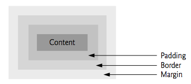
The Box Model
-
A critical note: border defines the
“end” of the element box in some sense
- Margin is a means to enforce a minimum distance between two elements’ borders
- READ THE LAST SENTENCE CAREFULLY
- What this means: margins do not sum
- Think of it as a “max” (which ever element has the largest margin will be enforcing the margin)
The Box Model
- Quiz:
- If you have an element with a margin of 5 pixels next to an element with a margin of 10 pixels, what will be the number of pixels between the borders? (this is the effective margin)
- If you have an element with a margin of 500 pixels next to an element with a margin of 10 pixels, what will be the number of pixels between the borders? (this is the effective margin)
The Box Model
Controlling borders
-
border-widthproperty
-
border-styleproperty
-
border-colorproperty
- Shorthand:
border: width style
          color;
Example: box_model.html
<!DOCTYPE html>
        <html>
        <head>
        <style>
        div {
            background-color: lightgrey;
            width: 300px;
            border: 25px solid green;
            padding: 20px;
            margin: 25px;
        }
        </style>
        </head>
        <body>

        <h2>Demonstrating the Box Model</h2>

        <p>The CSS box model is essentially a box that wraps around every HTML element. It consists of: borders, padding, margins, and the actual content.</p>

        <div>This text is the actual content of the box. We have added a 25px padding, 25px margin and a 25px green border. Ut enim ad minim veniam, quis nostrud exercitation ullamco laboris nisi ut aliquip ex ea commodo consequat. Duis aute irure dolor in reprehenderit in voluptate velit esse cillum dolore eu fugiat nulla pariatur. Excepteur sint occaecat cupidatat non proident, sunt in culpa qui officia deserunt mollit anim id est laborum.</div>

        </body>
        </html>
Floating Elements
- Allows you to move an element to one side of the screen while other content flows around it
- This “breaks” our notion of block elements (such as
p, div, section, h1-h6) to fill the width of the screen. - When used with element dimensions, page layout becomes very controllable
Floating Elements
- Three property values:
float: none;default, element is not floatedfloat: right;element is floated to the right. Other content can flow on the left sidefloat: left;element is floated to the left. Other content can flow on the right side
Floating Elements
-
clearallows you to specify that an element should not flow with a float (e.g. will not flow with an element on right/left; it will start below the floated element)
clear: left;do not allow floating to the leftclear: right;do not allow floating to the rightclear: both;do not allow floating to the light or right
Example: floating.html
<!DOCTYPE html>
        <!-- Example from: http://www.w3schools.com/css/tryit.asp?filename=trycss_layout_clear -->
        <html>
        <head>
        <style>
        .div1 {
            float: left;
            width: 100px;
            height: 50px;
            margin: 10px;
            border: 3px solid #73AD21;
        }

        .div2 {
            width: 500px;
            margin-left: 150px;
            border: 1px solid red;
        }


        .div3 {
            float: left;
            width: 100px;
            height: 50px;
            margin: 10px;
            border: 3px solid #73AD21;
        }

        .div4 {
            border: 1px solid red;
            clear: left;
        }
        </style>
        </head>
        <body>

        <h2>Without clear</h2>
        <div class="div1">div1</div>
        <div class="div2">div2 - Notice that the div2 element is after div1, in the HTML code. However, since div1 is floated to the left, this happens: the text in div2 is floated around div1, and div2 surrounds the whole thing.</div>

        <h2>Using clear</h2>
        <div class="div3">div3</div>
        <div class="div4">div4 - Using clear moves div4 down below the floated div3. The value "left" clears elements floated to the left. You can also clear "right" and "both".</div>

        </body>
        </html>
Margin and Padding
marginproperty specifies the required space between the border and the next element (see box model above)- Value is a length (px, pt, cm, etc) or a % of the page
- The
marginattribute is shorthand formargin-top,margin-right,margin-bottom,margin-left- See http://www.w3schools.com/css/css_margin.asp for margin variations
- Example:
margin: 50px 40px 100px 25px(what does this mean?) - Example:
margin-top: 100px
Margin and Padding
-
paddingproperty specifies the amount of space between the content and the border (see box model above)
- Value is a length (px, pt, cm, etc) or a % of the page
- The
paddingattribute is shorthand forpadding-top,padding``-right,padding``-bottom,padding-left- See http://www.w3schools.com/css/css_padding.asp
for padding variations
- See http://www.w3schools.com/css/css_padding.asp
for padding variations
- Example:
padding: 50px 40px 100px
              25px
(what does this mean?) - Example:
padding-top: 100px
- See:
media_types_queries.htmlorpositioning.html
Media Types and Media Queries
Media Types
- Allow you to specify what the page should look like on different media.
- Standarad media type is
screen, which stands for computer screen - Other options:
handheld(cell phone/mobile),speech(read out old),print(printers).
Media Types and Media Queries - Basic Example
/* media query example */
        @media all {
          body { background-color: black; }
        }
        @media print{
          body { background-color: white; }
        }
Media Types and Media Queries
Media Queries
- Allow you to query the user’s device and use
different CSS rules based on the media
height- height of display area (the browser)width- width of display area (the browser)resolution- resolution of the output deviceorientation- landscape or portrait
Media Types and Media Queries
Media Queries
-
CSS Syntax
/* media query syntax */ @media not|only mediatype and (media feature) { CSS-Code; } -
notnegates the media query -
onlyapplies the style only if the query matches -
Note: you may omit the
mediatypeand only specify a(media feature)if you wish
Example: media_types_queries.html
<!DOCTYPE html>
        <!-- Example from: http://www.w3schools.com/cssref/tryit.asp?filename=trycss3_mediaquery -->
        <html>
        <head>
        <meta name="viewport" content="width=device-width, initial-scale=1.0"/>
        <style>
        body {
            font-family: "Lucida Sans", Verdana, sans-serif;
        }

        .main img {
            width: 100%;
        }

        h1{
            font-size: 1.625em;
        }

        h2{
            font-size: 1.375em;
        }

        .header {
            padding: 1%;
            background-color: #f1f1f1;
            border: 1px solid #e9e9e9;
        }

        .menuitem {
            margin: 4%;
            margin-left: 0;
            margin-top: 0;
            padding: 4%;
            border-bottom: 1px solid #e9e9e9;
            cursor: pointer;
        }

        .main {
            padding: 2%;
        }

        .right {
            padding: 4%;
            background-color: #CDF0F6;
        }

        .footer {
            padding: 1%;
            text-align: center;
            background-color: #f1f1f1;
            border: 1px solid #e9e9e9;
            font-size: 0.625em;
        }

        .gridcontainer {
            width: 100%;
        }

        .gridwrapper {
            overflow: hidden;
        }

        .gridbox {
            margin-bottom: 2%;
            margin-right: 2%;
            float: left;
        }

        .gridheader {
            width: 100%;
        }

        .gridmenu {
            width: 23%;
        }

        .gridmain {
            width: 50%;
        }

        .gridright {
            width: 23%;
            margin-right: 0;
        }

        .gridfooter {
            width: 100%;
            margin-bottom: 0;
        }

        @media only screen and (max-width: 500px) {
            .gridmenu {
                width: 100%;
            }

            .menuitem {
                margin: 1%;
                padding: 1%;
            }

            .gridmain {
                width: 100%;
            }

            .main {
                padding: 1%;
            }

            .gridright {
                width: 100%;
            }

            .right {
                padding: 1%;
            }

            .gridbox {
                margin-right: 0;
                float: left;
            }
        }

        </style>
        </head>
        <body>
        <div class="gridcontainer">
            <div class="gridwrapper">
                <div class="gridbox gridheader">
                    <div class="header">
                        <h1>The Pulpit Rock</h1>
                    </div>
                </div>
                <div class="gridbox gridmenu">
                    <div class="menuitem">The Drive</div>
                    <div class="menuitem">The Walk</div>
                    <div class="menuitem">The Return</div>
                    <div class="menuitem">The End</div>
                </div>
                <div class="gridbox gridmain">
                    <div class="main">
                      <h1>The Walk</h1>
                      <p>The walk to the Pulpit Rock will take you approximately two hours, give or take an hour depending on the weather conditions and your physical shape.</p>
                      <img src="pulpitrock.jpg" alt="Pulpit rock" width="" height="">

                    </div>
                </div>
                <div class="gridbox gridright">
                    <div class="right">
                      <h2>What?</h2>
                      <p>The Pulpit Rock is a part of a mountain that looks like a pulpit.</p>
                      <h2>Where?</h2>
                      <p>The Pulpit Rock is in Norway</p>
                      <h2>Price?</h2>
                      <p>The walk is free!</p>
                    </div>
                </div>
                <div class="gridbox gridfooter">
                    <div class="footer">
                      <p>This web page is a part of a demonstration of fluid web design made by www.w3schools.com. Resize the browser window to see the content response to the resizing.</p>
                    </div>
                </div>
            </div>
        </div>
        </body>
        </html>